Brand identity
Jack and His Brother
Client
Jack and His Brother Ltd.
Deliverables
Branding
Logo design
Role
Designer
Date
2016

Jack and His Brother is a children-first media production company. The story is that on the day of launch, Jack and his brother disappeared leaving the studio in the hands of its viewers. They would create and display their own films, becoming the main content creators. The identity had to be light and playful and show collaboration between the creators.
My initial idea focused heavily on the children having a creative say in not only the content but how the show looked. I wanted them to create title cards, screen splashes and bugs using tools supplied by the show but to put their own spin on it, further demonstrating the collaborative, playful aspects of the client.
Although I wasn’t chosen for the final design, I was proud of my concept and the typography I created.
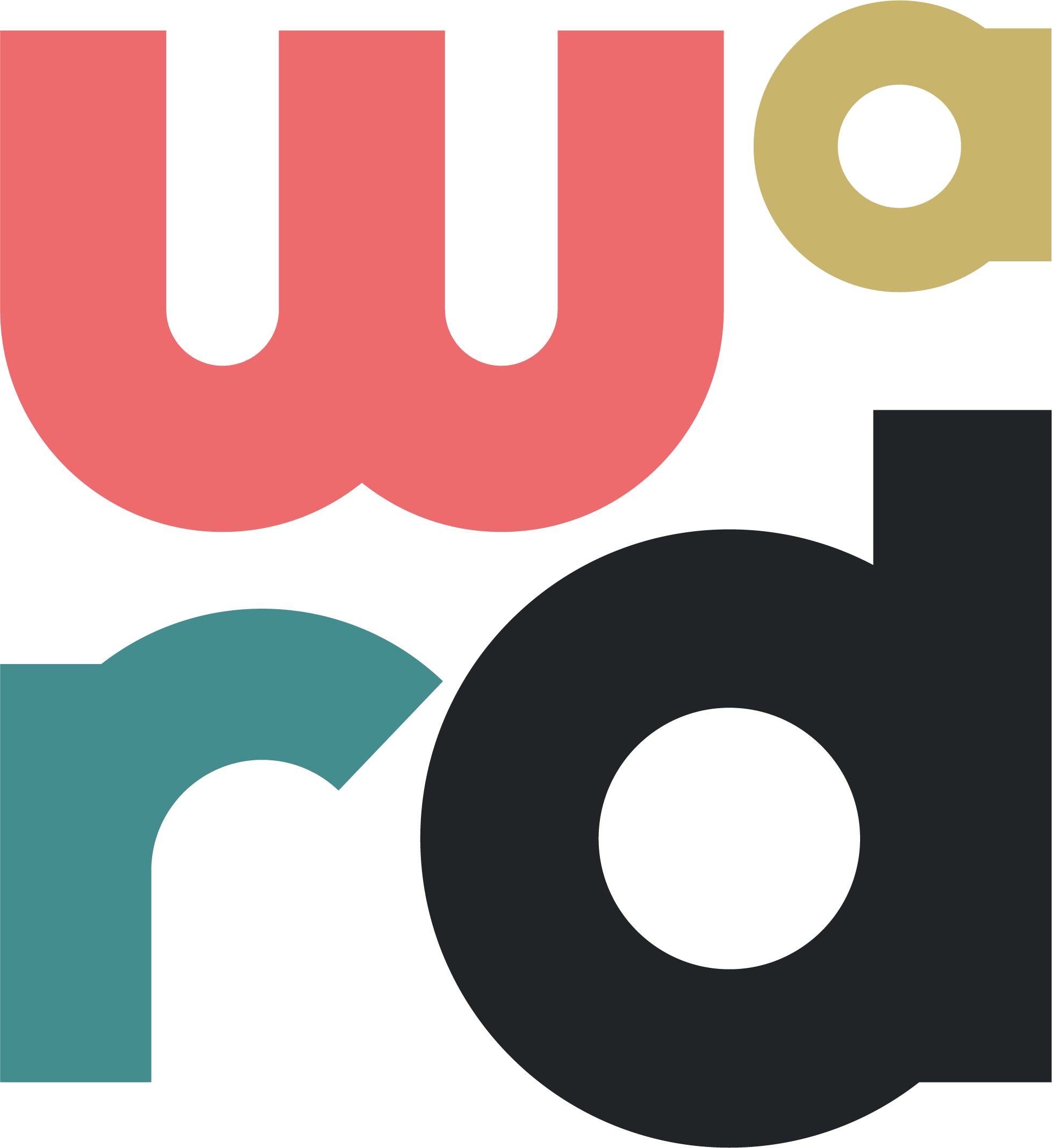
I created the typeface basing the glyphs on a 3×3 square, keeping the weight chunky and playful.


Get in touch
If you have a project in mind or just fancy a chat, send over an email to jacob@madebyward.com or use the form below.
